Banner Graphic Design Essentials For Display Advertising
There is not a day of ours in this fast-moving world that ends without the usage of the internet. Every time you open a search engine and surf through the web, we bet you would come across pop-ups and dialog boxes, prompting you in vivid and vibrant colors. To a common man, these might look like simple pop-ups, but to an entrepreneur, this is a potential market. From the stats, it is evident that there are around 4.57 billion users around the globe. A creative person with a perfect ad can make millions by reaching out to the right people. Despite the fact that people find graphic ads annoying, reaching out to people who are currently in need of your product might fetch you a great deal. So, it is not just about banner graphics, it is about how you design and whom you target to that matters.
Importance Of Banner Graphic In Advertising
A great banner graphic creates a profound first impression on your brand or product. It plays a crucial role in meeting all your advertising and marketing needs.
What Is A Banner Graphic?
A banner graphic is usually a visual representation of a brand and its products and/or services. It can be in the form of typography, design, image, charts, graphs, or anything that makes a brand’s ad visually pleasing and clickable. Imagine an ad without any graphics and designs. Will you ever notice a plain text ad? We bet you wouldn’t. The advent of the internet has increased our content consumption rate and decreased our internet attention span to merely 3 to 7 seconds.This again drives to the point that you have to create an attractive banner graphic that makes the viewer stop and notice your ad within this very short span.
The importance of banner graphics is described under the following titles :
1. Online Branding
Banner graphics take a huge chunk of responsibility in enhancing brand presence. Banner graphics can make your brand’s message loud and clear. Good banner designs can convey your brand’s idea, making the viewers want to click on the ad and know more about you. Brand retention is achieved through high-quality banner graphics.
Attractive and interesting graphics will help customers remember your brand.
Digital advertising is one of the best ways to let people know more about your brand. All that is needed for the effective growth of your brand is a great banner graphic, along with brilliant marketing strategies ( and, of course, your product!)
2. Generate Revenue
An attractive and crisp banner graphic can help a business increase its Click-through rate, thereby improving its sales. It is a general notion that having a high-grade graphic banner depicts a high-quality product or service. On the other hand, low quality, clumsy or unattractive graphics may portray your brand as a scam or an unworthy one.
3. Graphics Convey A Louder Message Than Words
An alluring banner graphic is important for any business that is looking to sustain or perform better in the market. The first thing to bring out a brand’s identity is the design of its logo. For instance, consider the logo of Apple . It does not even have a tagline but conveys the product’s quality effectively with just a simple illustration.

4. Graphics Transcends Languages
The internet is a multilingual platform. People from all over the world use the internet daily. A great blog with the best content in English can only be read by people who have a good grasp of the language. But on the other hand a good graphical illustration can surpass all the language barriers and can create a mutual connection among people of all languages. Anyone can understand visuals and themes, which is not possible in the case of language. A good design can attract diverse audiences across the globe. It can also be the best medium to build a strong bond with potential customers. Banner graphic has several advantages. It has the potential to make or break your brand.
What You See Is What You Buy!
Banner ads these days have become an inevitable component for advertising any business. It promotes branding and improves traffic, thereby helping you reach the right people.
A banner ad with an effective banner graphic has the potential to convert mere viewers into loyal customers. Banner ads are popular since they could be seen almost everywhere. It comes in exclusive colors, sizes and designs. If you are someone who surfs the internet daily then there is every chance that even without realizing you look at at least 5 banner ads a day.
Though it has a potential reach to the public, banner ads are not designed with that much care and concern. Banner ads have lost their credibility to produce effective Click-through rates (CTR) when compared with the other types of advertising. Honestly, these days it is hard to reach people through banner ads.
Marketers and business owners need a serious upgrade on how to create an effective banner ad. Most of the banner ads are created like a 15-second commercial that is dumped with a lot of information and hard to process design. To change this attitude, we need to understand that a banner graphic is not a commercial or a work of art. It is a piece of design that is used to entice viewers to visit your site to make a purchase or learn more about you. So the best way to create a banner graphic is to not put a lot of creativity and design in it. Even using minimal designs one can attract a lot of potential customers. The next thing to consider is the amount spent on banner ads. Do not let banner ads burn your pocket. You can create a greater impact by investing less and in choosing minimal designs.
Advertising psychology also has a major role to play in increasing your brand presence.
Remember, all our decisions are made subconsciously. So even the decision to click an ad banner or not has a subconscious intervention. A minor mistake in graphics that doesn’t appear appealing to basic psychology has a greater chance of getting ignored. For instance, You cannot run a hospital ad with vibrant red graphics. Most users would never mind skipping your ad in such cases.
Following Things You Need To Consider While Creating Banner Graphic
1. Size
Banner ads come in various sizes. Below are few most used sizes for display advertising.
| Name | Dimensions(px) |
| Medium Rectangle | 300×250 |
| Leaderboard | 728×90 |
| Wide Skyscraper | 160×600 |
| Large Rectangle | 336×280 |
| Skyscraper | 120×600 |
| Small Rectangle | 180×150 |
YOU CAN READ MORE ABOUT STANDARD BANNER SIZES HERE.
Apart from the ones mentioned above, Digital banners have standard sizes depending on their size by the Interactive Advertising Bureau (IAB), which has got thumbs up across the Globe. They are the Billboard (950 × 250), which is the largest of the five but is used only as less as 1%, the Leaderboard (728×90), which would most occupy either corner of the website screens and is chosen by about 25% of people, the Half page (300×600) which will almost cover the webpage as the name says but is preferred only about 5% of people, the Medium Rectangle (300×250) which is compact and most opted of all the types by about 40%, and lastly the Wide Skyscraper (160×600) which is being chosen by 12% of people. It is a favourable point that any digital banner would only be less than 150kb of size.
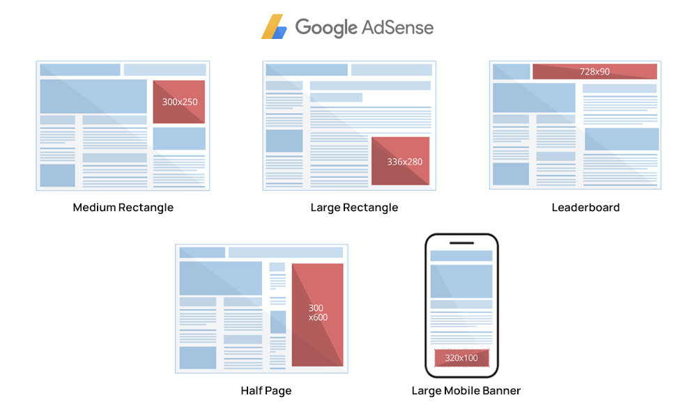
You need to carry out an in-depth analysis of all the sizes before you place the ads. Note that the image size should not exceed 50KB. Anything beyond that will take a longer time to load and no viewer would have the patience to wait for a mere advertisement.
READ MORE ABOUT STANDARD BANNER SIZES FOR EFFECTIVE CAMPAIGNS IN DETAIL HERE.
2. Call To Action
You should have the right Call to action button on your ad. This button is usually present towards the end of the ad. These ads basically carry the viewer from the host website to your website.
3. Keeping Design Simple
An ad with a heavy design is irritating and it takes a longer time to load. On the other hand, a simple advertisement makes the viewer’s read more about it. Your ad should consist of a headline describing the product/service, your logo, a picture of your product (optional), and an appropriate color that stands by your brand.
4. Placement
Be cautious about the placement of your ad. Even if you create a great banner graphic, if you place the ad at the bottom right corner of the webpage then your ad’s chances of getting viewed are very less.
Remember to keep all these key points in mind, while creating a banner ad or positioning it on a host website. This will help you reach the expected target and generate more potential customers.
Designing An Ad
Marketing has become an essential component to business of all cadre. Be it an MNC or a simple start-up, the fate of business relies on how the product reaches the consumer. Banners are of aid to the successful marketing of your product. Anyone can create a banner, but only the right banners reach out to people creating potential business.
Here’s a detailed guide on how to design an ad by Terry White – Principal Creative Cloud Evangelist for Adobe Systems, Inc.
TL;DW alert! – If you can’t spare an hour, scroll below for 10 quick tips to create banner graphics.
10 Banner Graphic Design Tips
Here is a list of creative banners and tips on how to design effective banners:
1. Always Keep It Simple
The first rule to create an attractive banner is to keep it simple. Do not overcrowd your banners with texts and images. Keep it simple and understandable. Using complicated words or images might affect the reach of the banner. Simple banners are usually made from single colors, bold and big fonts and a simple logo or image representing the brand.
2. Legible Fonts
People usually glance at the banner for not more than a minute. In such cases, your font must be big and legible enough for people to read. Use a font that is neat, elegant and legible. Alter the size of your font according to the size of the banner you are designing. You can also show a variation by using more than one font in your banner.
3. Picking Up A Perfect Background
Backgrounds form the base on which you work to create an effective banner. This could either be monochromatic or could have watermarks of images or your product itself. It is up to the creator to choose the type of background for their product. Pick attractive and bright colors like red or black or yellow to make your banner look catchy. Use contrasting mild colors for the font to keep your wordings readable.
4. Add A Picture Of Your Product
In a few cases, adding an image of the product you are marketing is a bonus. Try to include a picture of your product in an attractive angle. This is possible in case of creating banners for all tangible goods.
5. You Could Always Make A Mixed Bag
There is no set framed rules for creating a banner. It is up to the designer to make it as attractive and attention-seeking as possible. You can always use a combination of images, illustrations, texts and captions to your banner. Just a reminder, “At the end of the day all you need is an attractive banner”
6. Choose From A Wide Range Of Colors
You can create your banner in any color of your choice. But the most attractive banners are the ones that are designed using bright colors. Make sure your banner is attractive and eye-catching. Try to use contrasting colors for fonts and texts. You can also use a gradient background for your banner. The options are endless, start exploring to create a catchy banner.
7. Kindle Your Creativity
Creativity is the foundation for a successful banner. While designing your banner remember to keep it simple and creative. Adding a bit of humor to your banner can also capture the attention of viewers. You can brainstorm or even lookup suggestions on the internet while designing your banners. There are a lot of templates that are commercially available and you can always choose from them and modify accordingly.
8. Quality Images
In most cases, people try and incorporate images from the internet you don’t have to pay or hire a professional photographer to create your banner. You can simply surf the internet and get quality images or sometimes even banner designs that you can use to create an attractive banner.
9. Using Small Sized Files
Using large sized files might take a longer time to load. And no user will wait patiently just to view an ad. It is always better to use small sized files when it comes to creating banner ads.
10. Creating Ads In Several Dimensions
After you are done with ad creating, you need to position your ad in such a way that it falls in the view of the users. Preferably the top of the webpage or the right corners are ideal for positioning your ads. Leaving your ads on the corner of a page might not fetch you that many users. Create banner ads in multiple dimensions so that you can apply them to all webpages depending on the space provided by the host.
How to easily create banner graphics on QwikBanners?
Advertising has revolutionised since smartphones intervened in man’s life. From ads on newspapers, magazines and posters to advertisements on the internet, the strategy still remains the same. Using the right marketing tools would help you reach out to potential customers, thereby improving your business. From food to fashion to machines to travel, any company can create ad banners.
These days you don’t necessarily need to have a creative team to make a banner. With just an idea on what to include on your banners, you can create a banner for your business at a low cost.
Let’s get started!
Step 1: Create an account
The very first step that you need to follow to create your banner is Sign up with QwikBanners. Just like signing up on any other website, just by giving your E-mail ID and password, you will be ablet o create an account in no time. Once you sign up, you have to verify your account by responding to the generated mail from QwikBanners. Now, this is just for a one-day free trial. You can use the trial to check if QwikBanners is compatible and meets all your banner making requirements. If you are satisfied with this, then you can sign up for the subscription plans to make banners for all your products and brand.
You can pick a plan that suits your needs. QwikBanners also offers discounts on annual subscription plans.
Step 2: Choose a pre-designed template
The most difficult step in creating an effective banner is creating an outline or template. To solve this issue QwikBanners already has a wide range of pre-designed templates that you can choose from. There are several hundred templates to pick from. They also have these templates categorised according to the business such as lifestyle, food and beverage, education, software and so on. Depending on your business, you can pick a pre-designed template of your choice. There is a wide range of colours and fonts, which one can choose from to create an amazing banner.
Step 3: Customizing the template
After picking the template, you can customize the template according to your requirements. You can change the background colour or upload images from free stock images. You can include texts of your choice, change the opacity and even write texts in different font sizes. The next thing is the size. In the case of Website banners, there are several options in case of the size. You can design banners that are rectangular or square, horizontal or vertical.
You can download the entire set of banners containing almost all standard sizes. Just include the text of your desire in one banner, and the same would be applied automatically to the other sizes of banners as well. The entire set can be downloaded and can be used in different websites with different sized ad spaces.
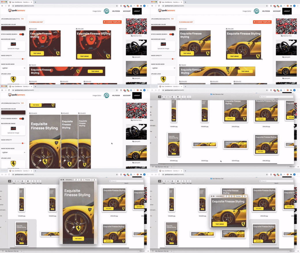
The best part is that it is easy and guides you completely in designing attractive banners. Even for the very beginners, using is just a piece of cake. With the customizable tools available, the options are endless. You can put in all your creativity to include logos or images or texts of your choice. If you already have a plan in mind, then generating banners would take no longer than a few minutes.
You can always choose a new template and begin fresh all over again. There are a few key points that you need to remember while designing ads. The first one is to use bright and attractive colours for the background. QwikBanners offers you over 200 colours of different shade variations to choose from. If your template consists of an upper and lower part, then you can choose two different backgrounds as well to make your banner look more attractive.
The next is the opacity. In case you wish to add a background image in the form of a watermark, then you can include the image and reduce the opacity of the background. You can type the text or content you wish to put on your banner to make it more legible and readable.
While designing banners, remember to work on a background which is contrasting the colour of your logo. This makes sure your logo is clear on the background. This is yet another form of branding.
QwikBanners also tells you the nature of the image that you are supposed to upload to create a banner that is almost similar to that of the template. By following these instructions carefully you can create a banner that matches the quality and reach of proven high CTR banners. QwikBanners is not just a tool, it guides you carefully through each and every step, and provides the maximum clarity required to guide you on the right track.
Conclusion
Whether in olden days or this present age, anything that should reach the public requires a good advertisement. Right from products, places, events, and shows, everything that needs people’s attention would require advertisement so that people can get to know about it in the first place. Now that the gadget screens get more attention than public walls, the culture of hanging banners is getting replaced by digital banners. Regardless of critics, digital banners are often ignored by the people, and banner graphics are still important.
Unlike regular banners, graphic banners are more fun and attractive. You can put in all your imagination to create a banner with puns, images and almost everything you can think of. The options are just endless. The ultimate goal is to grab the viewer’s attention and convert their requirements to business.
Anyone can create efficient, good looking banners with no prior knowledge of complex designing tools or software. All one needs is a simple idea on how you want your output to actually look like. With that in mind one can create a stunning website banner that would fetch you new potential customers.
An extended 15 days free trial awaits you, go ahead give it a spin here.




[…] has become the pillar of a robust digital advertising strategy, with more consumers interested in receiving personalized product recommendations from […]
Thanks for sharing your thoughts about 우리카지노.
Regards